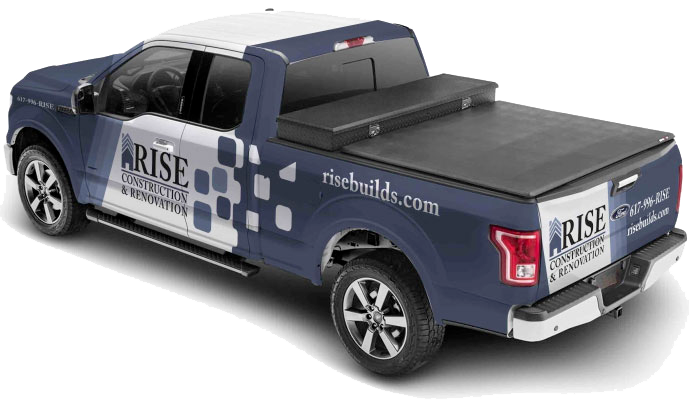

In the bustling streets of Boston, a vehicle wrap for your business can be more than just a moving billboard; it’s a powerful marketing tool that speaks volumes about your brand. Among the many elements that contribute to a successful vehicle wrap design, the font used to display important info is a crucial aspect that often goes unnoticed. This blog delves into the psychology behind font choices and how typography can make or break your vehicle wrap design.
Why Is Typography Important in Vehicle Wrap Design?
Fonts are more than just letters on a page; they are visual cues that convey emotions, influence perceptions, and can help establish brand identity. The right font can enhance readability, ensure your message is seen from a distance, and create a lasting impression on potential customers.
1. Conveying Brand Identity
Your choice of font style is a direct reflection of your brand’s personality. For instance, a sleek, modern font like Helvetica can convey professionalism and reliability, making it a popular choice for tech companies and financial institutions. On the other hand, a more traditional font like Baskerville or Caslon Pro might be suitable for businesses interested in a more “homestyle” look.
2. Enhancing Readability
Readability is paramount in vehicle wrap design. The text needs to be legible from a distance and at various speeds. Fonts like Arial and Futura are known for their clarity and simplicity, making them excellent choices for vehicle wraps. They ensure that your message is easily readable, whether the vehicle is stationary or in motion.
3. Influencing Perception
Different fonts evoke different emotions and responses. For example, Georgia, a serif font, exudes a sense of tradition and trustworthiness, making it ideal for brands that want to appear established and dependable. In contrast, sans-serif fonts like Helvetica and Futura offer a clean and contemporary look, perfect for modern and forward-thinking brands.
Popular Font Choices for Vehicle Wraps
-
Helvetica
- Use Case: Ideal for modern, professional brands.
- Psychology: Conveys simplicity, clarity, and reliability.
- Example: Tech companies, financial institutions.
-
Futura
- Use Case: Suitable for contemporary and innovative brands.
- Psychology: Modern, clean, and straightforward.
- Example: Design firms, startups.
-
Georgia
- Use Case: Great for traditional and trustworthy brands.
- Psychology: Classic, reliable, and elegant.
- Example: Law firms, educational institutions.
-
Impact
- Use Case: Perfect for bold and eye-catching designs.
- Psychology: Strong, impactful, and attention-grabbing.
- Example: Sports brands, event promotions.
What Fonts Work Best for Vehicle Wraps?
The best fonts for vehicle wraps are those that remain easy to read from a distance and at driving speeds. While decorative fonts may look attractive on a computer screen, they often become difficult to read when displayed on a moving vehicle.
Some commonly recommended fonts include:
| Font | Best For |
|---|---|
| Helvetica | Professional service businesses |
| Arial | General business branding |
| Futura | Modern and innovative companies |
| Impact | Bold promotional messaging |
| Montserrat | Contemporary branding |
Businesses should prioritize clarity and readability over decorative styling to ensure their message can be understood quickly.
Tips for Effective Car Wrap Text Design
1. Prioritize Readability
- Use large, bold fonts to ensure your message is readable from a distance.
- Avoid overly intricate or decorative fonts that can compromise legibility.
2. Contrast is Key
- Ensure there is a high contrast between the text color and the background to enhance visibility.
- Use light fonts on dark backgrounds and vice versa.
3. Keep It Simple
- Less is more when it comes to vehicle wrap text. Use concise and clear messaging to ensure it is easily digestible.
- Focus on key information such as your business name, contact details, and a simple call to action.
4. Font Choices Should Be Consistent
- Use fonts that align with your brand’s identity to maintain consistency across all marketing materials.
- This helps in building brand recognition and trust among potential customers.
How Do You Make Vehicle Wrap Text Readable?
Vehicle wrap text should be designed with visibility in mind. Most people only have a few seconds to read information on a moving vehicle, so readability should always take priority.
Best practices include:
- Use bold, clean fonts
- Maintain a strong contrast between text and background
- Limit the amount of text
- Use large font sizes for contact information
- Avoid overly decorative typography
A simple and readable design often performs better than a complex design with excessive text or visual distractions.
Typography Recommendations by Industry
Different industries often benefit from different typography styles depending on the image they want to project.
- Contractors and Home Service Businesses
Bold, highly readable fonts such as Helvetica, Arial, or Montserrat help communicate professionalism and trust.
- Law Firms and Financial Services
Traditional fonts such as Georgia can create a sense of credibility and authority.
- Technology Companies
Modern fonts such as Futura and Montserrat help reinforce innovation and forward-thinking branding.
- Retail and Promotional Businesses
Impact-style fonts can be useful for highlighting promotions, special offers, and event marketing.
Frequently Asked Questions
1. What font is easiest to read on a vehicle wrap?
Simple sans-serif fonts such as Helvetica, Arial, and Futura are often considered the easiest to read from a distance.
2. Why is typography important in vehicle wrap design?
Typography influences readability, brand recognition, and how customers perceive a business.
3. How much text should be included on a vehicle wrap?
Only essential information should be included, such as the company name, contact details, website, and key services.
4. What font size works best for vehicle wraps?
Font size depends on vehicle size, but important information should always be large enough to read from a distance.
5. Can typography affect brand recognition?
Yes. Consistent typography helps create a recognizable visual identity and improves brand recall.
Choosing the right font style for your vehicle wrap design is not just about aesthetics; it’s about making a strategic decision that influences how your brand is perceived. By understanding the psychology of typography and applying best practices when designing a new Boston Vehicle Wrap, you can create an awesome ad for your business that not only catches the eye but also communicates your brand’s message effectively.
Need a vehicle wrap design that is both visually appealing and easy to read? Contact Wrap Solutions today to discuss your project and create a wrap that strengthens your brand and attracts attention on the road.