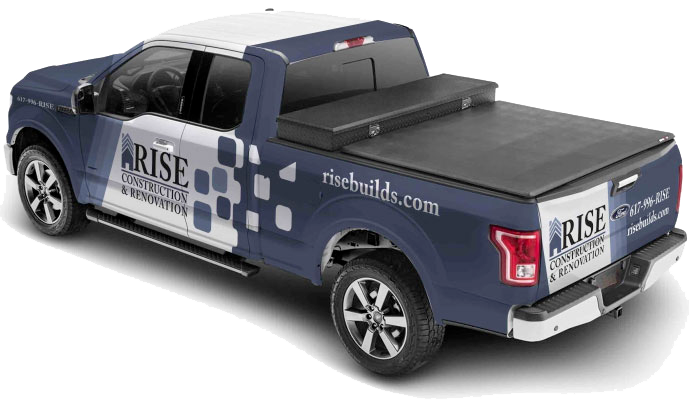
Commercial vehicle wrap design is one of the easiest ways to turn the trucks and vans you already own into nonstop advertising. Your fleet is out on the roads every day, sitting in traffic, parked at job sites, and rolling through neighborhoods. With the right wrap, every mile gives people a chance to get to know who you are and what you do.
A strong wrap can get seen thousands of times as drivers sit at red lights or crawl along the highway, especially in busy spring and early summer traffic. Those quick glances only last a few seconds, so every part of the design has to work hard. When the layout is clear and bold, your fleet becomes a moving sales machine instead of just another group of plain vehicles.
In this article, we will walk through common commercial vehicle wrap design mistakes and how to avoid them. When you plan your wrap with care and lean on a professional shop, your investment keeps paying off for years.
Cluttered Designs That Confuse Drivers
One of the biggest mistakes is trying to say everything at once. On the road, people do not have time to read long lists and tiny paragraphs. If your wrap is packed with details, most drivers will not read any of it. Their eyes will skip around and then move on to the next car.
Common clutter problems include things like:
- Long bullet lists of every service you offer
- Multiple special offers or coupons on one vehicle
- Busy background photos that fight with your text
- Several different fonts and colors competing for attention
When there is too much going on, nothing stands out. The wrap feels noisy instead of clear.
A better approach is to keep one main message. For example, focus on your top service or your biggest benefit. Then build a simple layout around that idea:
- Logo in a strong, easy-to-see spot
- One main headline that explains what you do
- A short call to action with clear contact details
Leaving open space around your key information makes it easier to read while the vehicle is moving. Clean design looks more professional and makes it more likely people will remember your name later.
Poor Readability and Weak Branding
Even a simple design can fail if people cannot read it. Small fonts, fancy script letters, and low-contrast color choices can all make your wrap hard to see from a distance. If your dark text sits on a dark photo, or your letters are thin and light, the message gets lost.
To make your commercial vehicle wrap design readable, think about:
- Large, bold typefaces that are easy to read at a glance
- High contrast between text and background, like dark letters on a light field
- Short lines of text so words do not feel crowded
Branding is another key piece. When colors, logos, and styles change from one vehicle to the next, it is harder for people to recognize your company on the road. If one truck has an old logo and another has new colors, the fleet does not feel like a team.
Stronger branding comes from:
- Using the same main brand colors across all vehicles
- Keeping one updated logo and using it in a consistent way
- Placing your logo, website, and phone number in similar spots on every wrap
When your fleet looks unified, each vehicle reinforces the others and your name sticks in people’s minds over time.

Ignoring Vehicle Shape, Surfaces, and Seasons
Designing only on a flat screen can lead to big problems once the wrap hits the actual vehicle. Real vehicles have curves, door seams, body lines, rivets, fuel doors, and windows. If you do not plan for these, you can end up with a phone number cut in half by a door gap or a face stretched over a wheel arch.
Different types of vehicles also need different layouts. A long box truck has large, flat sides that work well for big images and large text. A pickup or small van has more curves and breaks in the body. Panels, windows, and doors all change where graphics should go, and what size they should be.
A few tips we think about when planning designs:
- Keep key details like phone numbers away from handles and seams
- Make sure text does not run across sliding doors or sharp bends
- Adjust artwork for each vehicle type so the wrap looks balanced from every angle
New England weather is another factor to consider. Spring and summer are busy driving seasons, which makes them a smart time to have fresh wraps on the road. At the same time, we know that sun, road salt, and temperature swings can be tough on graphics. Good planning means using quality materials and smart placement so your wrap holds up through hot sun, cold snaps, and coastal air.
Low-Quality Images and DIY Artwork
Even a clever concept will look weak if the artwork itself is low quality. Pixelated photos, blurry graphics, and stretched images can make a brand look dated. Clip art or mismatched stock images can also cheapen the feel of the wrap.
Common problems when someone tries to handle commercial vehicle wrap design on their own include:
- Using logos pulled from email signatures instead of high-resolution files
- Designing without proper vehicle templates, so artwork does not fit right
- Working in the wrong color modes, which can shift colors when printed
- Sending files that are not truly print-ready
Large-format printing is its own world. What looks fine on a laptop can fall apart when it is blown up on the side of a van. A professional in-house design and print team works with wrap templates, understands scale, and uses high-resolution images so the final product looks sharp across the entire vehicle.
Having design, printing, and installation under one roof also helps catch problems early. The same team that sets the layout knows how it will be installed on real doors, panels, and curves.
Forgetting the Call to Action and Tracking
A wrap that only shows a logo and a catchy tagline may look nice, but it misses a big chance. Your fleet is out there to bring in new leads, not just build name recognition. Without a clear call to action, people might notice your brand but not know what to do next.
Every effective wrap should include:
- An easy-to-remember web address
- A phone number in a large, readable font
- Optional extras like a QR code or short URL for tracking
Turn Design Mistakes Into a Stronger Brand Presence
When you avoid clutter, keep your text bold and clear, respect the shape of the vehicle, use high-quality artwork, and include a strong call to action, your commercial vehicle wrap design works much harder for you. Your fleet starts to look more unified and professional as it travels across Massachusetts, from busy highways to quiet local streets.
This is a good time to look at your current vehicle graphics with fresh eyes. Ask if people can read the main message in a few seconds, if the branding looks consistent, and if any key details are hidden by seams or curves. With help from an experienced, in-house team like Wrap Solutions, you can turn past design mistakes into a cleaner, stronger brand presence every time your vehicles hit the road.
Get Started With Your Project Today
Ready to turn your fleet into a powerful mobile billboard that reflects your brand perfectly? At Wrap Solutions, we work with you to create a custom commercial vehicle wrap design that fits your goals, timeline, and budget. Share your ideas, brand assets, and vehicle details so we can build a concept that helps your business stand out on the road. If you are ready to discuss your options or get a quote, simply contact us and our team will be in touch.