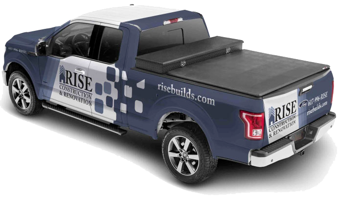
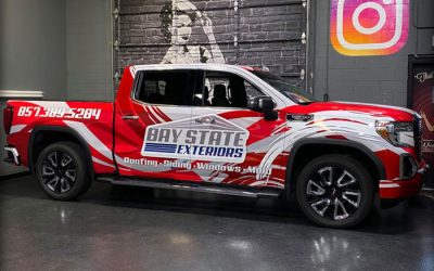
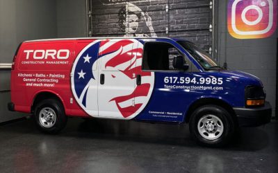
Wraps on a fleet on vehicles aren’t just about making your trucks or vans look good—they’re one of the most effective ways to get your brand out on the road. Whether you’re driving through Boston neighborhoods or parked on a busy street, a well-wrapped vehicle becomes a moving billboard that can leave a lasting impression. But it’s not just the wrap itself that matters. The colors you choose can either catch people’s attention or fade into the background.
That decision isn’t just about what looks cool—it’s about what works for your brand. Picking the right color lineup helps tie everything together, from business cards to logos to the wraps on a fleet of vehicles. And when the color matches what your business stands for, people are more likely to connect and remember it.
Understanding Color Psychology In Branding
Every color sends a message. Whether people realize it or not, they’re picking up on mood, tone, and trust based on how something looks. It’s the same reason why fast food spots often lean toward bold reds and yellows—those colors tend to grab attention quickly and feel high-energy. Brands that want to show calm or reliability might go for blues or grays instead.
Here’s a quick breakdown of what different colors often suggest to viewers:
- Red: Bold, energetic, urgent
- Blue: Professional, steady, trustworthy
- Yellow: Cheerful, approachable, friendly
- Green: Fresh, nature-focused, balanced
- Black: Sleek, strong, upscale
- White: Clean, modern, open
- Orange: Friendly, confident, fun
- Purple: Creative, unique, high-end
When choosing colors for wraps on a fleet of vehicles, think about the message you want people to remember when they see your trucks pass by. A local landscaping service might choose greens and browns to reflect nature and earthy tones, while a tech repair business could lean into blues and silvers for a sharper, cleaner feel.
Making your color match your message is one part. The other is making sure it actually stands out where the vehicles are seen the most. Boston and the surrounding area has its own backdrop, and your fleet needs to pop against it—without looking out of place.
Choosing Colors To Stand Out In Boston
Boston, MA gives you a lot to consider when thinking about how your vehicle wraps will appear year-round. From snowy roads in winter to leafy neighborhoods in fall, the background your fleet drives through changes constantly. That’s why the best color choices aren’t always just about brand personality—they’re also about how to stand out clearly in every season.
Boston’s fall scene brings a lot of oranges, dark reds, and browns. If your fleet vehicles run routes through wooded or residential areas, tones like deep greens or maroons might blend too easily into the background. On the flip side, white or bright blue wraps can pop against all that natural color and help people notice you more quickly. Winter is another story. Snow and road salt dull everything. A pale gray or silver van might disappear into the scenery, while bold colors like navy or red can really stand out.
Here are a few quick tips when picking colors that work well:
- Use high-contrast tones. Light-colored text or logos on darker wraps—or vice versa—help your info stay readable.
- Think ahead to the seasons. Consider how wraps will look during snowy, rainy, or sunny days.
- Try layered shading. Adding accent colors or gradients can help your brand remain visible even as light conditions change.
- Watch your neighborhood surroundings. If you’re often near brick buildings or concrete lots, avoid tones that match too closely.
One local delivery company learned this the hard way when their tan fleet, designed to match their logo, blended right into the sidewalks and beige buildings around the city. After updating to a deeper color with high-contrast white lettering, they noticed more people recognizing them by name.
Color choice affects visibility just as much as it impacts branding—and both can help people remember who you are after one drive-by.

Consistency Across The Fleet
Once you’ve picked the right colors for your fleet, the next step is staying consistent. If some of your vehicles are wrapped in slightly different shades or feature uneven designs, it can start to look unprofessional pretty fast. Uniformity builds trust.
This doesn’t mean every wrap has to be exactly identical, but your main branding elements—color, logo placement, and text—should all follow the same pattern. Skipping out on consistency makes it harder for people to associate your wraps with your business, especially if your name or logo isn’t big and bold.
Here are a few tips for keeping that branding tight across the board:
- Pick one main base color for all your wraps, and limit the number of accent colors to one or two. Too many can feel cluttered.
- Place logos and contact info in the same spot on each vehicle so people always know where to look.
- Use the same font styles and sizes throughout to tie it all together visually.
- If your fleet includes different types of vehicles, like vans and trucks, keep the color scheme and proportions consistent even if the layout adjusts.
Getting everything aligned upfront saves time and headaches later. It helps create a strong, clear look that people will start to remember and trust.
Color Choices That Improve Visibility And Safety
Beyond branding, the colors on vehicle wraps can affect how easily your fleet is seen from a distance—or in tough driving conditions. Whether it’s fog rolling off the Boston Harbor or a downpour in the middle of rush hour, being clearly visible keeps your drivers and other people around them safer.
Certain shades work better than others when it comes to catching the eye. Bright colors like yellow, orange, and red are probably the easiest to spot and are often used on school buses and construction vehicles for a reason. But even if bold colors don’t match your branding, you can still increase visibility with smart color contrast and reflective add-ons.
Here’s how to boost road safety without losing your brand look:
- Choose color combinations with strong contrast. Black on white or white on navy reads quickly from far away.
- Keep background graphics light if your text or logo is dark, or vice versa.
- Use reflective materials, especially for door lettering or rear panels. These help your vehicle remain visible at night or in low-light conditions.
- Avoid super dark tones for large wrap areas unless broken up with lighter accents or stripes.
For example, a plumbing service in Wilmington swapped out their dark green wrap for a lighter teal base with bold white lettering. Same name, same logo. But the wrap suddenly became a lot easier to spot from the road—especially on gray, rainy days. Visibility might seem like a small detail, but when you’re on busy roads every day, it really matters.
Your Wrap, Your Visual Voice
Choosing the right colors for wraps on a fleet of vehicles goes way beyond what looks good. It’s about staying memorable, matching your message, and making sure you stand out around town. When your colors are carefully chosen and applied with consistency, your fleet becomes one clear, united message on wheels.
That message works all day, in all seasons—parked or on the move. Whether you’re rolling through snowy Wilmington streets or stopped at a fall festival downtown, your wraps say something before your crew even steps out of the van. Put some thought into the shades and layout now, and you’ll give people a reason to remember your brand long after they’ve seen it drive by.
Ready to take the impact of your wraps on a fleet of vehicles to the next level? At Wrap Solutions, we specialize in crafting designs that not only enhance visibility but also align perfectly with your brand. Discover how our expert team can help transform your fleet into a powerful branding tool through custom wrap solutions tailored to your business. Contact us today to learn more about how we can transform your fleet vehicles with an awesome custom vehicle wrap.